Polished to Flat

Easy Note by Cosmin Capitanu

So I’ve been checking out Forrst, Dribbble and Behance (among other places) and I’ve been noticing these designs done in a certain style, a style much more minimalistic than the web 2.0 styles that took the world by storm just a few years ago.

This type of style consists of flat colours, sharp edges (as opposed to rounded corners, and very few effects added. A very well known example of this type of style would be the all new Windows 8 interface. Personally I wouldn’t call this style minimalistic, I think it goes a little further than that. I would call it ‘flat’ to be honest, and that’s not an insult on it, I just don’t think minimalism is minimalistic for this style.

Before this style, there was the ‘web 2.0’ style or ‘polished’. Sharp gradients, rounded corners, shiny things, metallic colours, strong silvers, web banners shouting things at you like ‘FREE’ or ‘50% OFF’. ‘Flat’ design is like a parody of that.

If you are a web designer, like myself, you might have seen this ‘flat’ style around and wondered about if you should design like that. I’ll give you a little story, a few weeks ago I was creating a set of buttons for somebodies website, I worked in a ‘polished’ style because, looking at their website, it looked like they would fit in there. I show them to the person and they tell me that they hated all of the gradients and bright colours and rounded corners. They wanted something more ‘flat’. So I went back to the drawing board, then Illustrator and then finally photoshop and I made him a flatter set of buttons, they liked it, they said they liked it because everybody else had buttons like that on their sites. I still look at that site and see the buttons, they just don’t fit in, I think the more ‘polished’ set would have suited it more.

I suppose my point to that story is that you should try designing flatter stuff because even if you don’t like it, others do. But by all means you should not just copy each other, if you want to design a site in another style you should do it, just consider something ‘flat’ too. Trends aren’t always bad.

Design Case Study: Grooveshark

I am one of those people who enjoys listening to music when I do things (such as  writing this post) and Grooveshark is one of the many places I go to find good music. I decided to do a case study on the design of their website and of their business because I have always admired their style.

Grooveshark and their colour scheme

Grooveshark has a colour scheme of black and orange, this is visible on the front page of their website. The reason why I am discussing their colour scheme though is because Grooveshark does not strictly stick to it. If you check out their blog site you will notice the orange/yellow has been replaced with purple, but in my opinion this does not hurt their design or image, I think it enhances them, it shows that they are not afraid to try other colour schemes. Many websites will use a certain colour scheme and will be scared to stray away from it because they think it will hurt their image but I think this is proof that when done properly it causes no harm.

Grooveshaek blog site

Grooveshaek blog site


Old Grooveshark and New Grooveshark

Grooveshark's upgrade ad

Grooveshark’s upgrade ad

Grooveshark always updates it’s website, it always improves on the way it looks. The above image is of an advert to upgrade your account on Grooveshark (from old Grooveshark). I included this image because it shows what sort of a style Grooveshark were going for on their site. Now they have a lot less illustrations. They try now to quickly get to the point. There is no doubt that new Grooveshark is much slicker, cleaner than the old one. Nothing major changed on Grooveshark for this to happen, it was just the small things but they were important things non the less.

To finish up here I want to show you some work based on the Grooveshark design that I though were very interesting (some are concept, some are not).

Grooveshark Mobile (HTML5 app) by James Barnes

Grooveshark Top Left by Thomas Reed

Grooveshark Icon by Sam Jones

Grooveshark Remote by Sam Jones

Amazing UI Elements from Dribbble

If you haven’t already guessed, I have a great love of user interfaces and web design. Here is just a few of the user interface designs I have seen on Dribbble which really stood out to me..

Nav Menu Style by Art Sevarni

I like this design because it combines real world elements with the virtual world of the web which we live in.

Mini player by Eric Deiner

This is a simple/minimalistic design. What I think really makes it stand out for me is the amazing shadows which give it a 3 dimensional look.

Swiss knife by Smena

I love this because it adds a little extra creativity to a simple open/close type button.

This was just a short post but in the future I will post with more shots I love from Dribbble.

Dealing with IE

I consider this a good read for anybody interested in web development..

federicoponte

If you ask any web developer what they think about IE, they will answer it sucks. The reason is quite simple, you need to adapt the page to work on it. Besides, it doesn’t follow any standard well and have many bugs.The worst part of all is that at least one third of the Internet users use it.

In the past months i had been creating a web page and solved several problems regarding IE. Here are some tips:

  • css3 not working well on some IEs

    The best solution will be using different style sheets. Simulate some of css3 feature in css2. For example the border-radius can be solved using margin, padding and background attributes.

    If you just want to use the same style sheet for all, this will be pretty helpful: CSS3 PIE. But it won’t be as nice as the first one.

  • js issues

    Use a javascript framework…

View original post 107 more words

Some of the Best Questions Ever Asked on ux.stackexchange

For any of you who are interested in the topic of user experience or who are designing a website; this post is for you. All these questions are from ux.stackexchange.com. Though some of them may seem like nonsense, I think they hold some important tips..

1. Should error messages apologize?

Credit to Addison from Dribbble

2. Is there a difference between “login” and “log in”?

Credit to Daryl Ginn from Dribbble

3. Do you need a search button with a search box?

Credit to Phyek from Dribbble

4. How to discover what users NEED and not what they WANT?

Credit to Bart-Jan Verhoef from Dribbble

5. Do “add” or “edit” functions need a confirm button?

Credit to Mac Tyler from Dribbble

6. What explains the current shift from glossy UIs to matte UIs?

Credit to Kajdax from Dribbble

7. Do touch screens have a harmful psychological effect on people?

Credit to Helvetic Brands from Dribbble

8. If nobody reads Privacy Policies or Terms and Conditions, why not change them?

Credit to Jet Cooper from Dribbble

9. What reason could Nintendo have had for putting the A and B buttons the wrong way round?

Credit to Juicefoozle from Dribbble

10. What is the difference between Wireframing and prototyping?

Credit to Dash from Dribbble

Starting out programming: a review of Codecademy

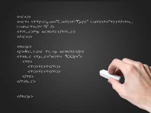
Coding

Coding

When I learned how to use Adobe Illustrator and Adobe Photoshop I decided that I wanted to create my own websites (at the point of writing this I am still not ready to create my own websites). The first thing I did was google ‘programming for beginners’ and what I found was Codecademy.

For those of you who do not know what Codecademy.com is, it is a site that aims to teach people programming who have have never programmed before. I started using Codecademy when it was a new site, when they were only teaching Javascript (they now teach other languages too).

For me, the thing about Codecademy was that even though it started at the very basics, it didn’t explain what you were doing. For instance I was doing one of their lessons where they talk about semicolons (those who program will know the importance of them) and although they tell you to use them, they do not explain why. I found this happening on a number of occasions.

Now don’t get me wrong, I don’t have a problem with Codecademy, I actually use it now to practice my programming, I just didn’t find them the most useful for teaching me programming from the basics.

If you want to know the way I actually learned how to program, I downloaded ‘Getting Good with JavaScript‘. What I found really helpful about this e-book was the set of screencasts that came with it to accompany the book. When I finished the book and screencasts I felt I had learned the very basics of Javascript and of programming. I decided to go back to Codecademy and I actually started to understand their lessons a little better because I had a little more knowledge of programming and of Javascript.

I’m not saying that Codecademy isn’t useful, I just don’t think it is the best place to go for the complete beginner. As an alternative method I suggest learning the very basics from somewhere else and returning to Codecademy for their intermediate tutorials.